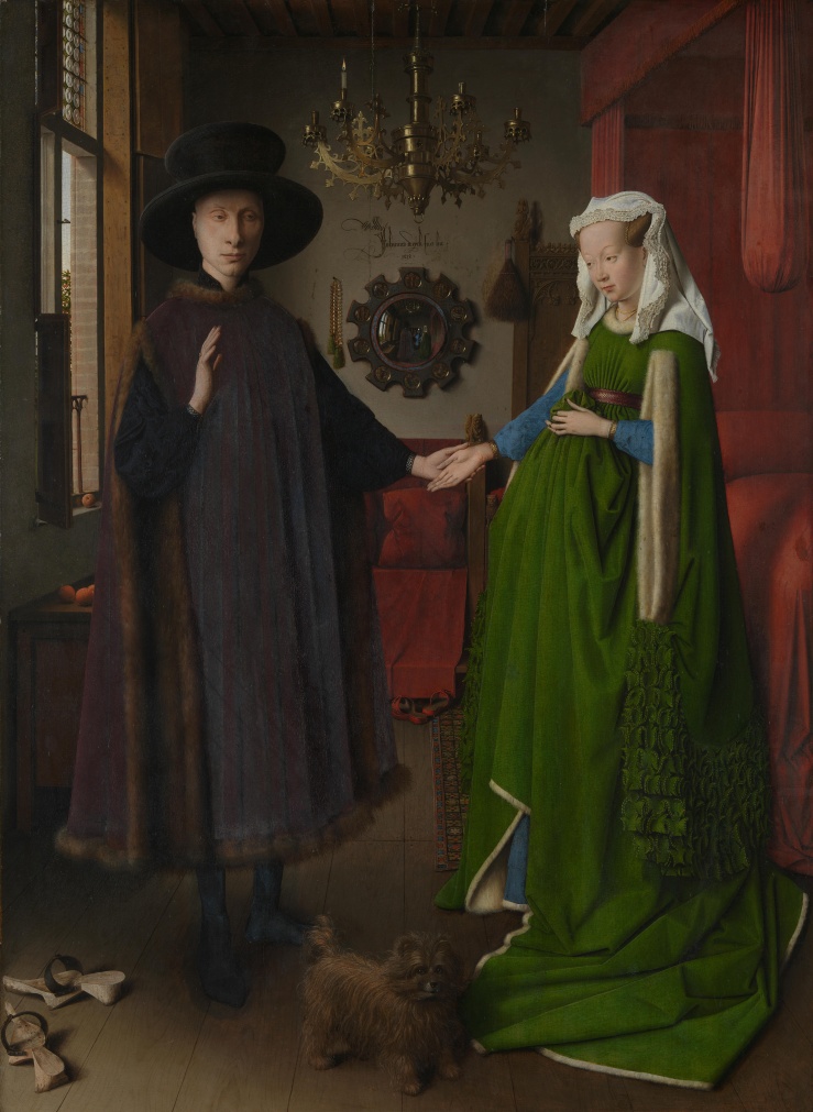
Artists manipulate form to convey content dictated by leaders.
The concept of commissioning art has been around for quite a while. When someone commissions a piece of art, they compensate an artist to create the art in the vision of the patron. The patron can request for it to look a certain way or deliver a specific message, but the work itself is ultimately in the hands of the artist. The “message” decreed by the patron will be referred to as the content, and means by which this content is illustrated will be referred to as form. The form clearly has influence on the content, and artists often display a high degree of sophistication and creativity when manipulating such form in the name of content.
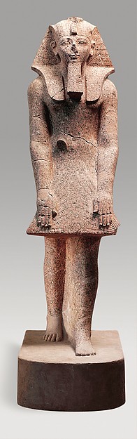
For example, in a statue titled “Hatshepsut in a Devotional Attitude” (Unknown artist, Dynasty 18, 1479–1458 B.C.), was commissioned by the Pharaoh Hatshepsut to commemorate her reign. Although she was a woman, she is shown with male pharaoh attributes, such as the beard and headdress. “For the ancient Egyptians, the ideal king was a young man in the prime of life. The physical reality was of less importance, so an old man, a baby, or even a woman who held the titles of pharaoh could be represented in this ideal form, as in this representation of the female pharaoh Hatshepsut. Although many of Hatshepsut’s statues depict her as the ideal king, the inscriptions always allude to her feminine gender, sometimes by using both masculine and feminine grammatical forms, sometimes by including her personal name, Hatshepsut, which means ‘foremost of noble women.'” (The Met). Also, the rigid stance she takes is typical of statues of royalty in these times, which further reinforces the view of Hatshepsut as Pharaoh. The content is meant to present her as a pharaoh, and only males were taken seriously as pharaohs, so adding male features contributes to the overall goal of Hatshepsut not only being taken seriously, but commemorating her as surpassing her male predecessors. Her Mortuary Temple was full of artifacts such as this, until her son had it all destroyed.
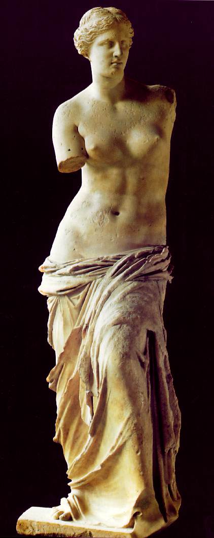
Next, the Venus de Milo was made by Alexander of Antioch. This sculpture is meant to depict the Greek goddess Aphrodite (the common name, Venus the Milo, is the Roman translation of a sculpture made in Ancient Greek times), and was likely commissioned by city-state leaders, rather than an individual. She is rather well known today. She represents the Greek ideal, illustrating the Greek definition of beauty: balance, order, proportion, and harmony. The incredibly advanced proportion of her body and the cascading nature of the fabrics draped around her makes this piece special, not to mention that it was made in the year 101 BC. “Generally speaking, shadows are more forceful when used in moderation. The Venus de Milo in particular, owes her strength to this moderation. The effect which she produces is powerful because there is no jarring note to distract the attention. Approaching her step by step, one persuades oneself that she has been modeled by the continuous washing of the sea. Is not this what the ancients meant when they said that Aphrodite was created in the bosom of the waters?” (Rodin, Seaton-Schmidt). The use of shadow and contour makes for a greater degree of detail, which is important in her overall purpose. She was certainly a beholder of the Greek ideal, but she was also meant to glorify Aphrodite. There has been a dispute surrounding whether this was meant to present Aphrodite or other Greek mythological figures, but it can safely be said that her ideality is a way of glorifying figure that was worshipped in these times. The fact that this goddess is ideal makes people more willing to worship her.
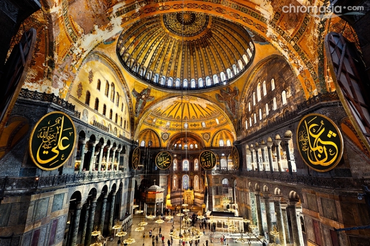
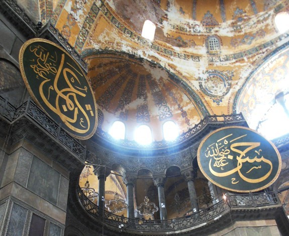
In addition to the hand of the artist being easily seen in sculpture, it can also be seen in architecture. The Hagia Sophia, built and rebuilt over the years, is a great example. It was first built in 415 as a Greek Orthodox church and the seat of the Patriarch of Constantinople. In the 1200s, for about 50 years, it was a Roman Catholic church as well. The Regale Ekklesia, as it was known in these days, was originally created by architects Anthemios of Tralles and Isidoros of Miletos, who were most likely influenced by the mathematical theories of Archimedes. Originally, it had colored marble and intricate decorations on the floor and elsewhere were a result of Byzantine decree. As tine went on, the plans of this church were falling victim to earthquakes and such, causing it to be built and rebuilt a number of times. The mosaics on the sides of the walls were commissioned by different emperors. The images are vast, some with royal significance, some with religious significanc, and some with both. The different mosaic commissioned by different emperors cannot be seen, as they are covered by Islamic art. It was turned into a mosque in 1453 under Sultan Mehmet II. Over the next century, 4 minarets were built around the structure that carry religious significance. Ornate chandeliers commemorate Salesman’s conquest of Hungary, and the giant discs on the walls are Arabic calligraphy of the names of the 4 caliphs, the first four followers of Muhammad (pbuh). The dome was meant to symbolize the heavens. The base of the dome is ringed with windows, which allow light to flood the space, illuminating the works of art on the walls (Pentcheva). The placement and frequency of windows throughout the structure is an important attribute of form, which conveys content by allowing rays of light in a high frequency to illuminate the space in a controlled and deliberate manner. The overall content remains consistent through both of the religions that have inhabited this building: to promote religious education and present it in a way that people feel welcomed and willing to learn.
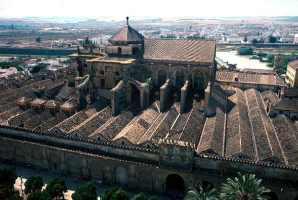
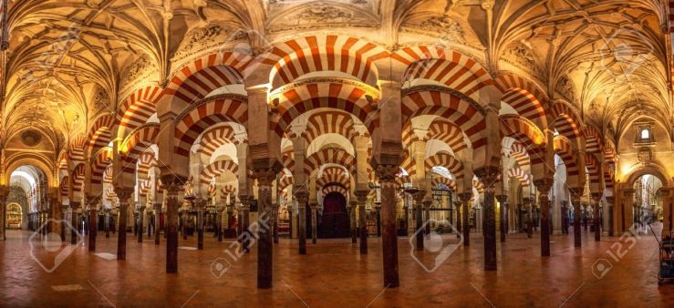
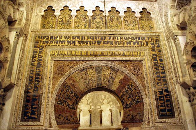
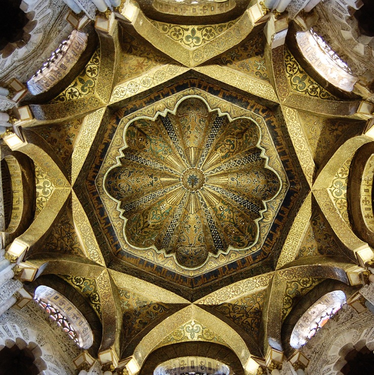
The Great Mosque of Cordoba was also shared by both Islam and Christianity at different times. In 978, when the Muslims ruled Al Andalus,which was composed of Muslim Iberia, it was commissioned under Prince Abd al-Rahman I, who had just fled from Damascus as his family was just overthrown, this beginning his rule in Muslim Iberia. The very design of this mosque was meant to imitate the grandeur of the Great Mosque in Damascus; he even imported fruit trees from Damascus and encouraged similar architectural and agricultural practices.the Great Mosque of Cordoba is “celebrated for its harmony, balance, dramatic use of light and decoration, and its overall unity and aesthetic sensitivity, the monument belongs to an established functional type, the hypostyle mosque, but amounts to more than a mere variant of this type” (Khoury). It is known for being among the first of the hypostyle hall mosque, along with its mihrab, horseshoe arches, and dome. They have a repeated pattern of two-tier roman columns along with the repetition of the roman arch. The repetitive form creates an organized space in which people can pray facing the correct direction (towards Mecca), which is the intended content, to promote pray and worship inside the mosque. The mihrab is a horseshoe arch prayer niche where the imam (the one leading) stands in prayer. The wall that it is on indicates which way Mecca is in relation to the way the building is faced, so that Muslims can face the Ka’ba when praying. This mihrab is special because of its lavish decorations and the unusually large size of the mihrab itself, being nearly the size of a small room as opposed to the size of an actual niche (Ecker). The form of the mihrab being fancier than necessary comes from the patron’s desire for it to resemble the mosque in Damascus, building it in perhaps even greater grandeur to convey to the people that this new reign would be as good, if not better than the current reign in Damascus.
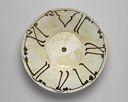
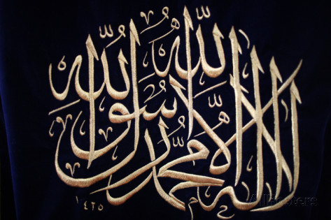
Islamic calligraphy is also connected to form and content. Although there have been countless works of art for countless patrons, the evolution of Islamic calligraphy can clearly be seen as simple, easy to read and understand calligraphy written on parchment shifts to instances such as calligraphy on household objects. This appears more fanciful. It is not quite as clear as the earliest version of Islamic calligraphy, but legible nonetheless. The long strokes up the sides of the bowl make it more interesting to look at, which makes people more likely to read it. The fact that it is written on a bowl means that it is viewed frequently, whether on the dinner table or in a cabinet. “The place of calligraphy in Islamic art tradition is quite unique. In the Islamic lands, from the very beginning, writing and the Arabic language played a central role (the written text of the Qur’an was given by God himself and has to be revered and carefully kept) : it is for that reason that the development of calligraphic art has remained current until modern times. To effectively study Islamic calligraphy it is necessary to consider artistic principles and theories, religious veneration for writing, philological evidence, and cultural or political history” (Richard). This case is special, because it best illustrates content versus form. The words themselves are the content, and the way in which they are written is the form. The form still consists of the words themselves, but the creative element of the size and shapes of the letters makes all the difference in how this content is received. The purpose of the content is always to spread the word of Islam and promote education of the religion, but the evolution of the form uses varied mediums through which to express the content, changing the way it it received every time.
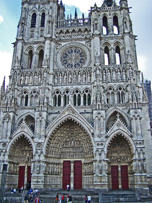
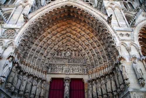
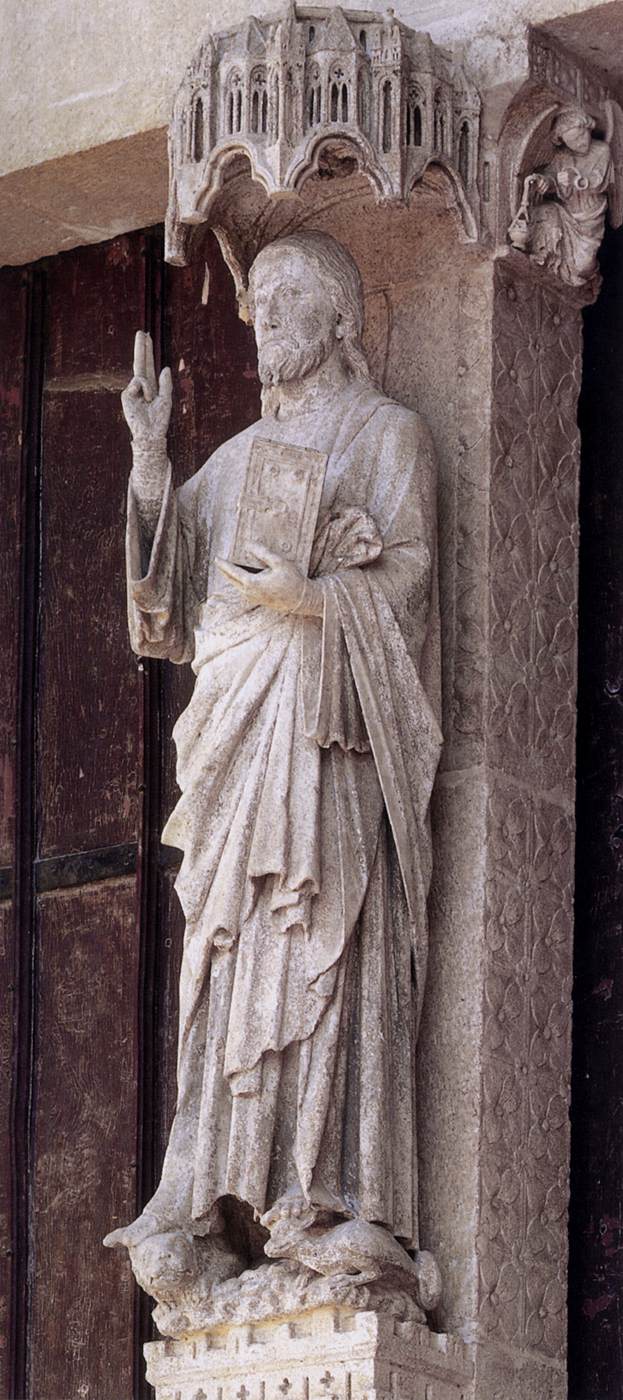
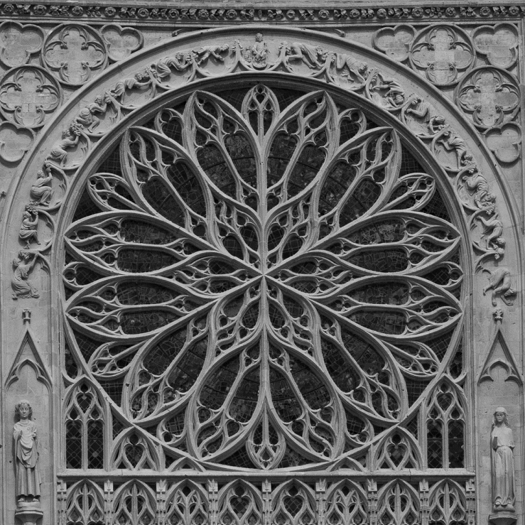
Lastly, the Ameins Cathedral is another great example of form affecting content. Again, the overall purpose of this cathedral is to be a place where people can worship, educate the masses about this religion, and make it look inviting and interesting so that people also have the desire to learn. The tympanum on the west portal is meant to depict Jesus as the central figure, looking over the final judgement surrounded by saints. This serves to illustrate a concept from Catholicism. The importance of the last judgement is one of the first things that people see as they enter. It is made to open up to the viewer, which might make it seem welcoming. There are multitude of other features that promote this content, but the most important would be the rose and stained glass windows inside the tracery on the inside of the structure. “At the level of the ave aisle windows, the addition of lateral chapels has led to the removal of the tracery – original windows remain only on the west sides of the transept arms” (Murray). These original windows depict scenes from the Bible, which are meant to educate the largely illiterate masses. The goal, the overall content was meant to bring people towards this religion, through education and community, which is addressed by the form that is found in these stained glass windows. Bible scenes literally surround anyone inside, so they are bound to learn something when they go inside the cathedral.
The concept of form affecting content is reasonable, but sometimes people fail to recognize just how powerful this influence is. The leaders who commission these works of art have they messages conveyed both explicitly and implicitly. It is explicit, as people generally know the objective of the patron. But it is also implicit, as the form of the art itself delivers messages that often go unrecognized as almost subliminal expressions of content.
Annotated Bibliography:
http://www.metmuseum.org/art/collection/search/544446
- This is an article from the Met Museum, which is presented without specifying its author. It includes many images showing the statue from new angles. The article discusses Hatshepsut as a pharaoh as well as some of the specifics of the physical attributes of the sculpture.
Rodin, Auguste, and Seaton-Schmidt Anna. “To the Venus De Milo.” Art and Progress 3.2 (1911): 409-13. Web.
- This is an academic journal by Auguste Rodin and Anna Seaton-Schmidt discussing the history of the Venus de Milo and showing her in a variety of different angles. This helps to comment on her physical attributes as well as the condition of the statue itself – which is missing both arms as a result of the time period and battle that was going on at that time of its discovery.
PENTCHEVA, BISSERA V. “Hagia Sophia and Multisensory Aesthetics.” Gesta 50.2 (2011): 93-111. Web.
- This is an academic journal by Bissera Pentcheva. It discusses the effects of the aesthetics of the physical structure has on the people who visit it. This helps to comment on the current condition of the Hagia Sophia, as a museum left with mostly remnants of its days of being an Ottoman mosque.
Nuha N. N. Khoury. “The Meaning of the Great Mosque of Cordoba in the Tenth Century.” Muqarnas 13 (1996): 80-98. Web.
- This is an academic journal by Nuha N. N. Khoury, which examines the Great Mosque of Cordoba as a prominent artifact in the category of hypostyle hall mosques, which became the norm for mosques for years to come. Even today, mosques are built in the tradition of hypostyle halls.
Ecker, Heather. “The Great Mosque of Córdoba in the Twelfth and Thirteenth Centuries.” Muqarnas 20 (2003): 113-41. Web.
- This is an academic journal by Heather Ecker that discusses the Great Mosque of Cordoba and its mihrab. She looks at the significance and purpose of the mihrab, and how it fits into the Great Mosque of Cordoba itself.
Richard, Francis. The Art Bulletin 89.2 (2007): 368-70. Web.
- This is an academic journal by Francis Richard. It discusses Islamic calligraphy and some of the changes it has undergone over the years. Since it is still prated today, several comparisons are made between the different time periods of its conception.
Murray, Stephen. “Looking for Robert De Luzarches: The Early Work at Amiens Cathedral.” Gesta 29.1 (1990): 111-31. Web.
- This is an academic journal by Stephen Murray. It discusses the construction of the original structure and talks about the additions and modifications made over the years.